


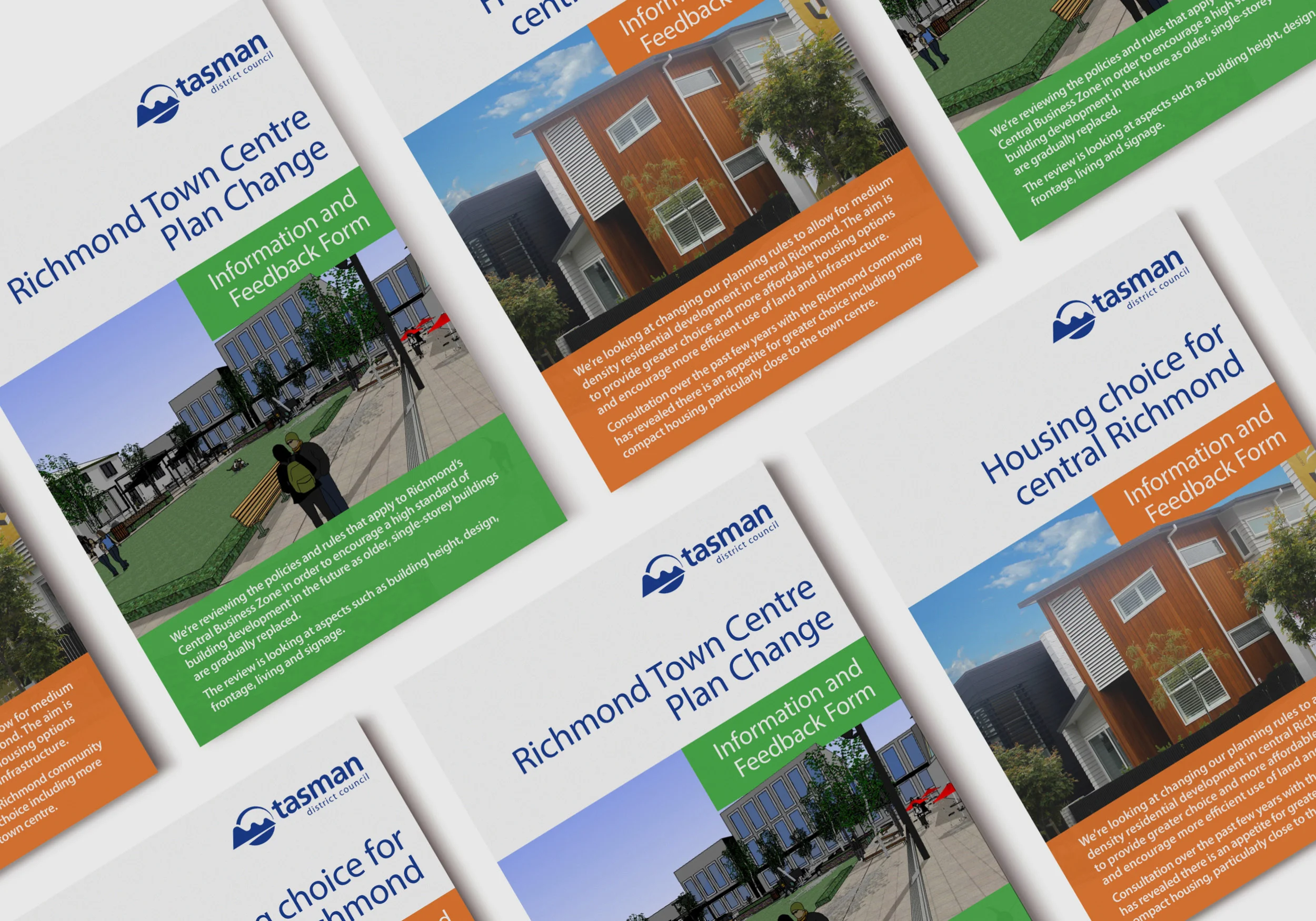


Tasked with re-imagining the brand/identity of the Council, the main focus was on developing a cleaner, and more easily used logo with much more engaging branding and imagery. This was achieved by simplifying the logo and brand to a single colour with much cleaner and engageing design rolled out across all collateral. The reduced colour palette and simplified design allowed for greater impact when used with strong imagery, and also resulted in cheaper print and production costs for the Council.
Brand revision and development, design and layout of corporate plans and reports, various print and digital collateral, illustration.